Styling DUALUSE
Adventures in sunk-cost. Deux.
Travis dropped
I really wanted to play around with fonts - at least 90% of building this site was an excuse to play with typesetting.
Read on for invaluable notes on how to spend an excessive amount of time tweaking font styles.
Font Families
The only font I knew I’d use was the code font, Fira Code, the others I selected after spending an afternoon scrolling through hundreds of entries from Google Fonts. Here’s what I was looking for;
- The usual sans-serif font for body text.
- A sprinkling of serifs for headings, and captions.
- My favorite ligature-supporting monospace font for code.
- Unexpected fourth font to break loading times, CDNs, and the rule of ‘3 fonts’
I found a great sans-serif font in Molengo featuring fun symbols, and delicious numerals with deep descenders (or is it ’non-lining’?1). Most-importantly, I could get Fira Code and Molengo just about at the same x-height for inline code, and the two families’ weights match well.
Playfair Display fit the bill for captions and headers - there’s a lot of different weights here - so I could match it to the rest of the document. My favorite thing about this font is its flamboyant italic capitals. The italicized variant used for captions introduces a bit of pressure, but I like the look too much to use something more reasonable.
Finally, I grabbed Philosopher to break up my technical rambles with extreme quotations.
An apt quotation is like a lamp which flings its light over the whole sentence.
That’s the right amount of standout. Yeah, I like how it turned out. Let’s get on to styling and using them…
Colors
This site features a basic three color two color theme (with various shades); main content at light grey, secondary at a bold slightly darker grey, background at dark grey, and callouts in teal.
My main body text is colored at #9f9f9f, with headings at #757575. One thing to account for is that most people perceive a font as darker with decreases in font size (at least on this dark background). Simply fixed; I just transition through #757575 on h1 to a lighter #7f7f7f in h6.
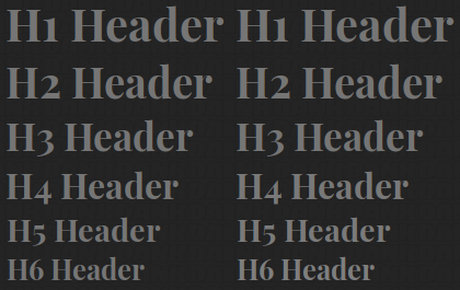
Visual interest, in my riveting sometimes long-winded and dry material, is kept with pops of teal at #00796b, used in links, code-blocks, asides, and blockquotes. The darkening effect is at play on the top eye ASCII - I lighten it significantly to #00bfa5 (basically turquoise). If you couldn’t see the effect in my headers - you can definitely see it here.
X-Height & Weight
There’s a concept of reader pressure, if all the various factors in written text add up to a difficult to read document you’re putting more pressure on the reader to interpret it. Well typeset documents have limited pressure, and poorly ones have high pressure.
Getting x-height and font weight right in mixed font-content is a huge factor in legibility (and pressure). On the web, there’s not much you can do to correct typefaces with hugely different x-heights and weights.

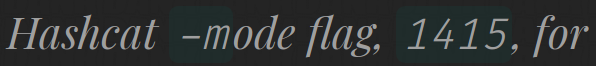
Fira Code (styling make clean && make) is only a hair smaller in both dimensions than Molengo, and letter spacing is about as close as you can hope for mixed monospace and proportional fonts. With Molengo at 1em Fira Code Regular just matches up at .85em.
My second context for inline code blocks was amongst Playfair Display Italic used in captions;
To make Playfair Display Italic, used for captions, work well with inlined code blocks was less perfect. Playfair’s character stroke width is really variable - Fira Code Regular matched on the vertical strokes, but was overall thicker. Fira’s Light variant looked significantly closer in weight - I went with conspicuous spacing differences over mismatched weights. Bam that’s another web-font you get to load. I was pleasantly surprised by how well the -m lines up with “ode” in the figure above.
Print is frequently overlooked by those styling websites, probably because nobody has owned a printer for the last decade. Due to DUALUSE’s content, I expect some material to be exported as PDF, and occasionally printed to paper. The basics of a print style you can guess; drop the background and switch to true black text. That’s more than most people will bother doing. In addition to body, header, and link colors - I change all the code syntax highlighting to chroma’s monochrome bw style.
The only real oddity to deal with is CSS display values for controlling element layout. My flex-box layout works pretty well on the screen but print is another matter, Chrome consistently failed to prevent overlapping page content, and text separation, if any display: flex; elements remained.
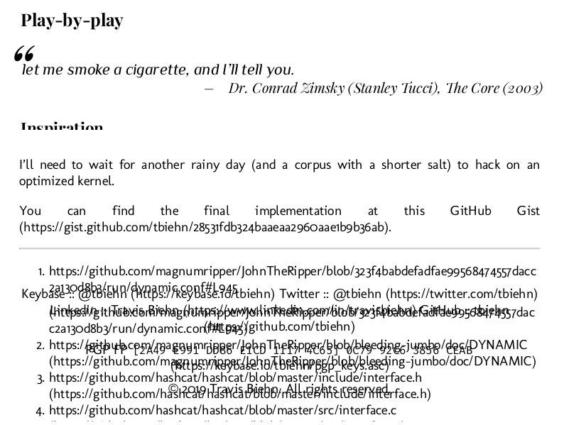
After some trial and error, I narrowed this down to flex-box. If pages are printing like the above - change those flex’es back to blocks in your print style.
You also want some control over where physical page breaks are rendered;
pre, blockquote, dl, ul, figure, header, p, aside, table, img {
	page-break-inside: avoid;
}
page-break-inside: avoid tells the browser to try avoiding page breaks within the content of the specified elements.
Chrome does a great job respecting this directive, but I didn’t have any luck getting a heading to stick with the next block of content (like a paragraph) using page-break-after. Along with that, I include some niceties like rendering a page URL next to a link and dropping as much non-content matter as is reasonable.
Finally, as I expect to include some generated graphics, I adjusted my img shortcode to allow for a secondary, print-only, image.
Here’s how it all comes together on a printed page;
All the topics outlined in this post work together to create a rendering that’s closer to a book than a website from the early ’90s. Curious for details? Right-Click-Inspect or view the source.